ScorchStack issue #14- Retro Edition
Why did Prince not release a song called 1998 for me to reference here
We originally planned to host this on GeoCities to really get that late 90s vibe but turns out that doesn’t exist anymore.
What’s inside?
The ScorchStack team breaks down all of the new NHL jerseys. You won’t BELIEVE which we like the most (it’s Blasty).
An exclusive trip to Finland to meet Miikka Kiprusoff.
Would you like to spend $90 on a very old t-shirt? What if I told you it was a Calgary Flames t-shirt and the goofy design trends are now ironically cool and fashionable?
A very serious piece addressing the controversy on our most recent podcast: we meant to talk to a different guy named Ted Kaczynski and were unaware of who we were actually talking to.
The Flames have already resurrected a fan favourite jersey… but there’s another one that deserves the same justice.
Since last week
Did you read ScorchStack #13? We paid tribute to the life of Alex Trebek and wondered how the Flames would kill each other if they were in a battle to the death, among other things.
Blasty, but you already know that.
Scorchstack Reviews the Reverse Retros
The Good, the Boring, and the Truly Awful
by the ScorchStack (all of us!)
Of all the times I have been actively invested in jersey reveals, I cannot remember a time where every single team revealed new jerseys at the exact same time, all part of one big event like we saw was the Reverse Retros on Monday. All 31 teams released new(ish) jerseys for the upcoming season on Monday and some of them were really good! Some were downright horrible, yes, but with so many jerseys being released under this genuinely unique premise, it's not surprising.
We here at Scorchstack are known experts in all things hockey and fashion, so it is only fitting that we bestow our thoughts and feelings about the new threads. Please note that all of these are real facts and we will not be taking any comments at this time.
Anaheim Ducks
Konnie: The mad bastards actually did it and brought us the Wild Wing jersey and they didn't sugarcoat it either. You have the duck goalie bursting through the ice, the jersey in the jersey and even the edgy font on the back. Fully reverse of the original Wild Wing too. The only thing I will say is I wished the Duck itself had an eggplant jersey on instead of the white jersey to make a complete reversal. Other than that, I loved everything the Ducks did (I can’t believe I just said that). S Tier
Ramz: It’s extremely good. It fucks so hard. If I wasn’t a Flames fan, this would be the best jersey. S Tier
Mike: I love the Chestburster from Alien so this is a perfect gimmick of a jersey. Next up: bring back the Mighty Ducks cartoon series. S Tier
Nathan: The NHL frequently takes itself too seriously, and has zero personality. This jersey is extremely fun and dumb, which is when sports are at their best. Wild Wing is a himbo. Lost points for essentially being an away jersey. B Tier
Arizona Coyotes
K: Another team to bring back a 90s classic but with a twist, these jerseys are the original Kachina thirds but instead of green, the background is purple. I’ll admit the jersey is wacky, yet I just don’t think the purple works that well with the desert underneath. Still, it’s a nice concept and promotes the Kachina further. B Tier
R: I love this too, fuck you Konnie. I love the details at the bottom with the desert and the cacti. S Tier
M: I’d love it more if the Coyotes weren’t likely banking on this to distract from the Mitchell Miller situation. It’s an ode to the best part of 90’s NHL hockey: uniform diversity. A Tier
N: I want to love it, but that shade of purple just isn’t for me. All the other design elements are a hard yes. What is that, Rebecca purple? KSU purple? Whatever purple it is, it’s just not for me. B Tier
Boston Bruins
K: Man, I really like these. Traditional, yet bold. Just a pleasant design that frankly I wish the bruins never stepped away from. It’s a reverse from that early 90s design too, which gives extra points as well. A Tier
R: I feel like they did something? I just can’t pinpoint what it is. I’m sorry, I’m stupid. This is lower than D Tier, sorry. “I think you changed something but I’m too stupid to tell what it is” Tier.
M: Boston fans are all too dumb to realize this is a different shade of yellow. The cocaine bear is a nice touch however. C-Tier
N: Love that shade of yellow and the meth bear, but this jersey is probably pushing the limits of what Jeremy Jacobs considers fun and that’s disappointing. C Tier
Buffalo Sabres
K: This one is fun too. The Sabres took a third from an era that fans really like and swapped the colours with the ones that appear on the current jerseys. Its all very faithful, but I wish I like it more than I do. B Tier
R: This one looked like it had mixed feelings, but I like it I think it’s cool. I even showed it to Baba and he said it was “nice”. B Tier
M: I low-key love this jersey and it’s a rare moment the Pegulas approve something great. We all know in classic Pegula fashion (and the Sabres in general) they’re going to lose a lot of games while looking good. A Tier
N: This is a nice enough jersey, which is actually a raving compliment in Buffalo lately. Would have loved to have seen the 2010 era writing for the Buffalo at the bottom. C Tier
Calgary Flames
K: It’s Blasty. Oh my god, they actually brought him back. Intact. With a new stripping pattern. It’s beautiful. SSS Tier
R: Zero explanation. SSS Tier
M: It’s the greatest jersey ever conceived. Everyone else has brain worms if they disagree. SSSS Tier
N: 🤙SSS Tier
Floob: This is the only jersey I reviewed, because it’s the only one that matters. I can’t believe after campaigning for this for damn near a decade, the Calgary Flames - of all teams! - gave the fans what they wanted, and they absolutely crushed it. Everything about it is letter perfect and I love it so much. Viva Blasty. SSSS Tier
Christian: I also only care about Blasty. Blasty forever. I don’t care to learn what the good tiers are and what letters correspond to them, but this is in the best one.
Carolina Hurricanes
K: It’s still a bit weird that they are taking jerseys from the franchise that they used to be in a different city, but these still look very sharp. I do think the previous green ones introduced before are better, but these are still very solid. The grey stands out as the only good jersey with grey on it. B Tier
R: I love anything Whalers. A Tier
M: I love it and I love that Hartford fans are upset about it. No one cares! S Tier
N: Want to like it more, but I just don’t. Wish they had used the green jersey. The Whalers logo is still top notch though. C Tier
Chicago Blackhawks
K: You cant even show your logo without being embarrassed by it which makes you even more sad. You're an Embarrassment Tier
R: If you’re too embarrassed to even show your logo in the promotional video for a jersey where the whole point is the literal logo, you know your logo sucks. F Tier if there was one
M: They did a racism again. I don’t need to grade this shit and I wish them nothing but the worst in life.
N: The NHL knows that hiding the front of it in the reveal video doesn’t change the fact that it’s the logo, right? Sheesh. See me after class tier.
Colorado Avalanche
K: Ditto for what I said about the Whalers jerseys but the colour scheme works so well here. Everything works here. A Tier
R: I know some people are opposed to using old teams (like the Whalers), but I love it. And I love the colours and the details at the bottom. A Tier
M: My first hockey memory is Joe Sakic and his wrist-shot. It’s a great ode to so many players I loved and still love. S Tier
N: The colour scheme is beautiful, and an excellent way to blend new with old. As with Anaheim, lost points for me being an away jersey. That burgundy is such a rich colour, I want more of it. B Tier
Columbus Blue Jackets
K: It’s certainly different. It’s definitely reverse which is nice and it even uses the original logo. It’s weird to have so much red, but the Jackets are never gonna have another chance to have a jersey like this ever again so they took advantage of it. B Tier
R: I actually really liked this one. As Konnie said, it’s different and I think the colours are nice. B Tier
M: It’s different and I mean that in a good way. I guess we can call them the Columbus Red Jackets now! B Tier. Editor’s Note: Mike has been fired.
N: I was reviewing these with my girlfriend and she insisted that these looks like the Confederate Flag, which is ironic because the Blue Jackets were the good guys. D was the highest rank she would let me give them without glaring at me, and I don’t care enough about Columbus to think more on it. D Tier.
Dallas Stars
K: What the hell is this. Fans have been begging for the star shape to return since the Reebok days and you still seem to fuck it up terribly. Why so much white? Terrible. D Tier
R; Objectively awful. They missed a huge opportunity to do a North Stars theme and they fucked it up. Even if they didn’t want to go in that direction, they could have done something else. And the all-white on the ice? Barf. D Tier
M: Looks like Monster Energy. D Tier
N: I thought this was bad to begin with, and then I saw that Dallas is planning to wear white short and gloves with this and woof. That’s bad. Assignment incomplete, not graded.
Detroit Red Wings
K: Minimal effort, minimal thoughts. D Tier
R: I… they changed something I think? Ok don’t drag me but you know the white all star jerseys that had all the logos for the teams greyed out? It looks like that but just with the logo in colour. “I think you changed something but I’m too stupid to tell what it is” Tier
M: This jersey resembles what the Red Wings’ record the last few seasons. Car Accident Tier
N: It’s a practice jersey. Detroit is one of the oldest franchises, and with all the history their reverse retro is a practice jersey. They’re going to advertise Dylan Larkin making bad YouTube videos wearing these because they’re for practice. Assignment incomplete, not graded.
Edmonton Oilers
K: Are we supposed to be impressed you took the blue out of the Gretzky home jerseys and nothing else? C Tier
R: Same as above. It looks the same? What did they do differently? Genuine question. I don't think I pay enough attention to jerseys. “I think you changed something but I’m too stupid to tell what it is” Tier
M: This jersey will look great draped around the Connor McDavid’s injured body. B Tier
N: I extremely admire the Oilers steadfast determination to keep doing the same shit over and over and hoping it’ll eventually work again. Lottery Tier.
Florida Panthers
K: Absolutely beautiful. The thicker white stripes are not a big change but such massive improvements that make this jersey stunning. S Tier
R: These ones also had mixed opinions, but I think they’re cool and I love the shoulder pad. Although I do think the shoulder pad is nicer than the actual front of the jersey, it’s still nice. B Tier
M: I love it. One of my favourite memories was the 1996 Stanley Cup final and watching Uwe Krupp ruin this franchise and their perfect 90’s jerseys. A Tier
N: Similar to Blasty in that this jersey should have never disappeared. It’s beautiful, it’s a great colour scheme. Love it all around. But there can only be one Blasty. A Tier.
LA Kings
K: Arguably the most aesthetically appearing jerseys of the bunch. The logo is prime and the colours pop. The Kings found their new home jerseys. I’m 100% on board with these because they are essentially Lakers colours, but still prime. A Tier
R: This fucks. I hate to give the Kings credit but they killed it. A Tier
M: They call it Forum Blue but apparently Americans have the cognitive skills of a bag of smashed assholes. It’s royal purple and it’s beautiful! A Tier
N: Sure it looks incredible now, but that’s because we haven’t seen what Drew Doughty is going to do to it. I thought about that ahead of time. B Tier
Minnesota Wild
K: Hi! Welcome to Subway. May I take your order? B Tier
R: Shut up Konnie. B Tier
M: My first thought is Subway which means I think of the Subway across from work which smells like vagrant urine. I assume that’s what the entire state of Minnesota smells like. C Tier
N: You remember that weird arc in Community where Subway became a person and enrolled in community college? Does anyone else remember that bizarre short film that was a stealth Subway ad? Congrats to Subway for making me think of several other things before Jared now. B Tier
Montreal Canadiens
K: Another team to take advantage of the opportunity. Wonderful shade of blue, truly a reverse of their almost untouched home jerseys. A Tier
R: I LOVE this. I think they really encompassed a retro vibe with this jersey. A Tier
M: Habs fans love history, which this is soaked in. I don’t really care for it, their fans, or the team. It’s a nice shade of blue though. B Tier
N: Gorgeous shade of blue, makes the logo pop in a way that you wouldn’t expect for something that hasn’t changed in over 100 years. A Tier
Nashville Predators
K: This is a solid look and really well done reverse of the originals these are based on. The first yellow jersey they have done right. Should be their normal home jersey immediately. A Tier
R: What’s different??????? I’m ???? “I think you changed something but I’m too stupid to tell what it is” Tier
M: My first thought was the sight of vagrant urine in a Subway, in Minnesota while the Predators are in town. The shoulder patch is the best in the league besides Pucky the Whale. A Tier because of the shoulder patch
N: They should have made the shoulder the jersey. It looks like that one Digimon from the first season that was a hellbeast. Otherwise, I’m with Ramz. You tried? Tier
New Jersey Devils
K: Solid, if unspectacular reverse job. Feels quite festive too. B Tier
R: I think the colours are alright! I think it’s different but not too different that they could have fucked it up. C Tier
M: This is such a gorgeous colour-scheme. More people need to appreciate the usage of forest green here. B Tier
N: I’m with Mike. The forest green is gorgeous. I don’t care that people think it looks like Christmas. Christmas means nothing to me except Chinese food and seeing a movie (in normal times). A Tier
New York Islanders
K: This isn't a reverse at all. The only thing you’ve done are Alexei Yashin throwbacks. You didn't do anything Tier
R: Truly, what? If you put a gun to my head and told me to tell you the difference between their regular jersey and this one, I would die. You didn't do anything Tier
M: This looks like a jersey that Lou designed. Nothing is good about this Tier
N: Assignment incomplete, not graded Tier
New York Rangers
K: Oh, you were so close. You brought back the Liberty logo, yay! And that’s it. It looks 80% done. C Tier
R: This one seems to have very mixed emotions, but it does seem like non-NYR fans are bigger fans of this jersey while NYR fans are a little more critical. I like it and I love the Liberty logo. A Tier
M: They didn’t even pick the best Lady Liberty jersey. It’s okay but the thought of Tony Deangelo ruins it for me. C Tier
N: If they added something to the top (collar, shoulders, whatever) this would have been one of my favourites. As it stands, it’s just a nice logo on top of a Gildan long sleeve shirt. B Tier
Ottawa Senators
K: It’s definitely reverse, but since the new colours are limited, this turned out kind of boring. C Tier
R: Very boring and underwhelming. Also showed it to Baba, he said “Boring.” C Tier
M: This reminds me of Alexei Yashin-era Sens hockey which means it was actually enjoyable to watch. The only downside is that Eugene Melnyk will profit from this. C Tier but maybe C+ Tier
N: This is the same red and black pairing that edgy kids wear to the school dance. No thanks. C Tier
Philadelphia Flyers
K: The only team that can successfully pull off orange, I like this one a lot. Its a nod to the Lindros era and the black shoulder. Yokes with the white ends suits this jerseys. Only only gripe is it seems that the logo is too high up. B Tier
R: I do like what they did with the arms and changed it a little that way. Although it’s still too similar to their regular jersey. B Tier
M: I miss the Legion of Doom era Flyers so much. Eric Lindros is arguably one of the most influential players in hockey and we were robbed of many prime years due to concussions. It’s dated and it’ll probably look better with the full kit. B Tier
N: would have also gone B Tier likely, but the white sleeves look like an undershirt and I can’t stop thinking about that. C Tier
Pittsburgh Penguins
K: I have a soft spot for word jerseys and this one turned out pretty good because of it. Nothing special though. B Tier
R: Eh, not the biggest fan. C Tier
M: Did a middle schooler design this? D Tier
N: That is how you spell Pittsburgh. You tried? Tier
St. Louis Blues
K: Okay, this one is fun. It's a visual pun and I love that. Plus the reverse look works really well, even if the yellow is a bit drawn out because of the red. A Tier
R: Absolutely fucks. These colours together are *chef kissing fingers*. S Tier
M: I went back and forth on this. On one hand, it’s bold and unique. On the other hand I can’t think of anything truly positive about St. Louis. A Tier jersey, bottom of the toilet tier city
N: It’s a pretty jersey. B Tier
San Jose Sharks
K: Just kind of boring and it’s based on a jersey design that sucked back when they were worn. C Tier
R: This is awful. It looks so bad. The grey was not it. D Tier
M: Finally a distraction from San Jose’s awful salary cap situation and gloomy immediate future. D Tier
N: This looks like the knock off jerseys you get peddled if you mistype the NHL shop website and there’s a spoof company waiting to sell you a jersey. You tried? Tier
Tampa Bay Lightning
K: Man, the colour scheme works. It works even better than the jerseys they are based off of. Another jersey that should be the permanent homes. A Tier
R: I really like this one! I think they didn't mess with it too much to fuck it up, but they did enough that I can look at it and go, “Huh, that’s neat.” A Tier
M: A gorgeous jersey. I have very little to say because I hate this franchise. A Tier
N: No thanks. D Tier
Toronto Maple Leafs
K: These flat out suck. The logo is ginormous, the font inside it is ugly and the grey just doesn't make sense. D Tier
R: Absolutely terrible. Walmart jersey level. And the numbers on the back? Why that colour? It’s very bad. D Tier
M: Did Kyle Dubas hire one of his countless analytics interns to design this? It looks like someone thought they were good at data viz so they took a crack at jersey design. D Tier
N: Ramz said it best, absolutely Walmart jersey level. You tried? Tier
Vancouver Canucks
K: Gradient jerseys suck. D Tier
R: I do like the colours in general, but I’m not the biggest fan of the gradient. It looks like they learned how to use the gradient effect in Canva for the first time. C Tier
M: Only the Canucks who have a rich history of iconic looks to pull from would pick something so wretched that the only rational reason for picking it is to distract from a fall back to earth performance-wise next season. D Tier
N: This isn’t so much a retro jersey as it is they took their current logo and fucked up washing it and the colours bled in ways they shouldn’t have. You tried? Tier
Washington Capitals
K: Oh. My. God. These are so beautiful they made my jaw drop when I first saw them. Spectacular. The old format works almost flawlessly with the colours that the team uses currently. Its detailed without being busy. The main logo rocks, the shoulder logos are sick, and even the wordmark fits so well. They must be permanent jerseys from now on. S Tier
R: I love this one. The logo is extremely cool and I love the colours. A Tier
M: This reminds me a lot of Judas Priest’s album art from “Screaming for Vengeance” and Peter Bondra, a wonderful player of his era. A Tier magnificence
N: Excellent logo choice, excellent colour choice, excellent jersey. A Tier
Winnipeg Jets
K: You just massacred a wonderful jersey. Why? D Tier
R: Why the grey? Why do teams insist on going with a dark grey with an already dark logo? The contrast sucks ass. C Tier
M: Relocate the franchise again. Z Tier
N: An excellent way to honour Manitoba by having tons of black flies swarm the jersey. This jersey is as good as getting swarmed by black flies. D Tier
Vegas Golden Knights
Oh fuck all of Scorchstack forgot about Vegas. Butthole Jersey Tier
Thank you for reading the facts about the Retro Reverse jerseys. Please leave your donations below so that we can ensure all of our beloved staff receive their own Blasty.
Searching for Kiprusoff in the Finnish Wilderness
By Mike (@mikepfeil_)
Well beyond the confines of the city of Calgary — rich with their incoherent street directions and the awful Deerfoot traffic — lives a man who once called the fair Stampede City his home. In the sleepy, somewhat reserved, and often under-profiled nation of Finland, kilometres from the nearest town, lives a former goalie whose impact on our memories is priceless. That man is Miikka Kiprusoff.
The Scorchstack Team had spent months tracking him down. We reached out to the Flames: they provided no assistance. Obviously the launch of Ol’ Blasty was more important. We reached out to the Finnish consulate in Ottawa: they told us he was no longer available for comment. Fearing for the worst, I traveled to Finland in search of Kipper.
After weeks of searching across the countryside, eating food with way too many vowels in the name, working with local trackers, and citizens of an unincorporated community I spotted him… buying a carton of smokes. I made a simple request: let me document, within the parameters he set, a day in a life of his ghostly state of living.
After much deliberation (full disclosure: I offered to buy him three cartons of smokes) he agreed. In order to keep his home safe, he blindfolded me and put me in his pickup truck. When we arrived several hours later, we were situated in a picturesque clearing with a simple-yet-modern looking cabin. A lake, with water so pristine and clean that you can see everything below the water’s surface.
This is where he calls home and this is where my journey into who he is starts.
8AM - Awaken
It’s eight in the morning when Miikka awakens without an alarm. At this point in his life he will not submit to the will of alarms or expectations to awaken. His internal clock is set to 8AM today, which in retirement, is a more than suitable time to start the day.
Rather than immediately head to the kitchen to make a pot of coffee, he heads to the window to reflect on the beauty of rural Finland. We don’t know where he is located (editor’s note: Kipper refused to disclose where he is), but he said he can see nothing but trees and a pristine fresh water lake.
It’s in that moment that he bends time and space to will a cigarette into his mouth. Cracking the window slightly, he lights it and savors the moment. This will be one of approximately two packs of smokes he’ll go through in a day.
8:15AM to 11:00AM - Coffee & Sitting on the Porch
Kipper makes a pot of the blackest, most intense coffee imaginable. The roastery where he gets his beans is, like all things Kipper, mysterious and not detailed. He spends the next couple of hours sitting on the porch, drinking multiple pots of coffee, smoking, and questioning life’s greatest mysteries. One has to wonder what transpires in his mind’s eye, but I assume it’s beyond the interpretations of a mortal such as myself.
Not once do I dare break his Zen-like stare out on the lake that will be the canvas of our journey today. He grasp of his coffee cup is firm and I wonder if it’s capable of squeezing the life out of a person like he did to opposing hockey teams during his playing days.
It’s in this interval of the day that I begin to embrace the environment enveloping me. It’s too easy to become overwhelmed in our day and age by the anxieties of existence. Here, the near deafening serenity that the Finnish countryside provides is beyond comprehension.
11:15 - 11:16 - Respond to text messages and emails
Kipper indicated that he spends one minute of each day reading and then deleting every form of communication that gets to him. If he does respond to any of them, they are with texts that are less than four words. He’s currently using a Nokia 2720, which is the latest Nokia flip phone. The simplicity of the device is critical to maintaining the perfect level of harmony and tranquility in him.
Apps? They do not matter.
He mentioned there are zero minutes on his phone, which prevents receiving phone calls. This is a man who has carefully crafted a grove of secrecy and privacy around him. He mentioned casually that he paid the Finnish government to list him as dead for a year, just to go fishing without disturbance.
About five years ago, I wanted to go catch fish in a lake not far from here. I kept getting calls from the Calgary Flames about making appearances and spam calls about winning Publisher’s Clearing House. I went into Helsinki one day, walked right up to the Prime Minister of Finland, and I said, “Make it stop.” They did and I got to pretend to be dead for a year. It was the best year of my life.
11:16AM - 11:30AM - Prepare boat for daily fishing excursion
Every day it’s the same provisions: two packs of smokes, a bottle of vodka, seven sticks of dynamite, a revolver with a custom engraved handle of a fish, and a tacklebox which he refuses to let me look in. The boat is a crude, albeit sturdy vessel adorned with bullet holes and scorch marks.
When pressed about the visible burns on the boat, Kipper shrugs it off and nonchalantly explains how they occurred:
Explosion, while fishing.
He hands me the bottle of vodka and encourages me to take a swig. It was a welcoming gesture that allows me to become a citizen of his tranquil refuge. Any sense of fear is gone, not because of the vodka but because of the legend that he carries. I take a swig and Kipper cracks a small smile.
We push off from the dock which in a similar sense to his boat bares the same scars of an explosion - or countless explosions - in it’s past. If the maws of hell were this beautiful, I think everyone would jump head first into them. I trust him now just like I did as a teenager. I know that the next chapter of this journey will likely shape me, but at the time I had no idea what it would actually be.
11:30AM - 8PM approximately - Fishing
Over the course of the next nine hours we sat in near-silence casting our lines and fishing. The only sounds for the first four hours were the casual flicking sound of his lighter to light up another smoke. Occasionally I could hear a calming sigh of acceptance at the life he has chosen come out of him. By 4PM, Kipper had busted into the bottle of vodka he brought with us. The silence at various points became deafening as the flicking of his lighter soon drowned out to the serene nature around us.
Eventually I mustered up the courage to break the silence and probe further. This enigma of a man that Flames fans embraced over a decade ago is still the same enigma he was then. I asked him about why he chose this life, why he walked away from it all, and whether or not he was happy.
He reeled in his line, turn to me, put out his cigarette on the side of the boat, and looked at me. It was as if the face of god was staring a hole through my very mortal being. “It’s time to fish” he said, pulling out the dynamite he stowed away with us before pushing off from his dock.
In a moment that went by in a blur, Kipper lit a fresh dart, and then ignited the fuzz of the first stick of dynamite with it. Tossing it casually over his shoulder, I covered my body in the boat fearing that this was the end of me. I thought of my family, of the staff at Scorchstack, and the thousands of fans back in Calgary thinking of this man. A pillar of water shot up with a roar only equal to the chants of his name back in the Dome.
Fish, fish guts, water, and florae found at the bottom of the lake rained down upon us. His wry smile he showed earlier appeared again, only this time a feint chuckle came with it. He lit another stick of dynamite with his cigarette, handed me it, and gestured to toss it out into the lake.
In an instant I feel like I have been empowered by the Norse gods and every fish beneath me will soon feel the explosive might that I will possess. A calmness washed over me, not because I had this power in my hands that he gifted me but because he was there. Safety and my life was in his hands… and I trust him with it.
We continue lobbing the remaining dynamite into the lake, destroying thousands of years of nature. At one point I yell “Kobe!” hoping to garner a laugh out of Kipper. He does not laugh. It was as if he were alone, in an endless yet comforting prison of silence. The only thing that comes to mind is Giovanni Battista Piranesi’s Imaginary Prison.
Looking down off the edge of the boat, the bottom of the lake resembled something akin to the Battle of Somme in 1916. Desolation, craters, destruction all below the lake. Above it? The polar opposite as if this is truly a different plane of existence. Unsure about whether or not this was an intentional doing by Kipper, I probed. “The bottom of the lake is nothing like the surface. Is there a reason you fish with dynamite?”
He paused and visibly began to ponder the framing of my question. The wheels turning in his head were visible and whatever he provided could be compared to the meaning of life at this point.
It is a means to an end.
Before I could even summon the courage to probe further he spoke up again. “It’s getting dark. We need to find dinner.” It was evident that we would find a surviving fish - whomever survived the ruckus we created throughout the day - and that would be dinner.
In what seemed like an instant, Miikka hoisted up a trout larger than any fish I had seen in person. It was like he willed this fish into existence for our consumption. After carefully inspecting it and likely tapping into it’s psyche, he hands me his flip phone to take a picture of the catch. While getting ready to take the photo, Miikka takes his lit cigarette and puts it in the fish’s agape mouth. He then hands me his flip phone, asking me to take a photo.
Once a year… it’s nice to have an artifact of fun and be in a photo.
This was my “in”, my moment, and probably my only moment to ask the single greatest goalie to ever be a Calgary Flame about his time in Calgary. “Did you find it fun to be a Calgary Flame, Miikka?” He looked up from his fish, removing the cigarette from it’s mouth, and took a long drag of it before responding: “It was good.”
He’s as good at giving me nothing as he was at stopping pucks during his prime. It seemed hopeless — that nothing I could look for as an opening would exist. This odyssey that I found myself in chasing the ghost of Kipper’s career and seeking the answers I desperately wanted to document would not have the conclusion the team hoped for.
Amidst the inner monologue, Kipper appeared before me in my head; it was as if he transcended the time and space to wake me from my distraction.
It’s time we eat.
Approximately just-after 8PM to 10PM - Eating & Silence
The two of us returned to the dock and venture back into his cabin in complete silence. Walking to the cabin, he kept looking down at the fish he posed with in the photo as if this were the truest purpose he was put on this earth. This would be the meal of the evening and my distractions of taking in everything around me finally lowered enough to alert my brain that I hadn’t eaten in a day.
He took to the very humble and empty looking kitchen. The cupboards, open with no doors to hide the two plates he owned. There were no bowls, no standard kitchen fare, and no kitchen counter appliances. All that existed were the bare essentials: a fridge, a stove, and a small spice rack. While fileting today’s catch, I caught a glimpse of the spice rack: two goalie-shaped salt & pepper dispensers.
The only reference to hockey I’ve seen all day. They looked to be antiques, maybe an old family relic he was given years ago. “These are adorable. Where did you get them?” I ask, picking them up and showing them to him. He looks at me, staring a hole through my soul. I feel as if I’m transported to another dimension or I’m being banished to a shadow realm.
I won these in a game of life or death.
Sweat begins to bead down my forehead, a cold sensation shoots down my spine. Before I know it I’m back in the cabin. “Literal life or death? Or are you joking?” I ask. As if he knew I was going to ask it and before I finished my questions he quickly responds “Western Conference Final, 2004. I took these from [Evgeni] Nabokov.”
He grabs them from my hand, smiles, and returns to them to their home then begins preparing the fish he had caught. While he works on dinner, I spend some time wandering the place he calls home. He doesn’t stop me from perusing his premise, almost like he expects me to find a conversation starter but I don’t. The walls are adorned with zero mention of his career, of his achievements, or any semblance of hockey.
All that is there are photos, of fish he has caught, with cigarettes in their mouths. An empty frame stands awaiting today’s photo. On a small cabinet, I notice there is a cassette. Upon closer inspection it’s a Simon & Garfunkel single of “The Sound of Silence”. Confused, I pick it up and ask Kipper about it:
Mike: Hey, this is Simon & Garfunkel. Are you a fan of their music?
Miikka: I thought it was a cassette of literal silence, not a song.
The fish is prepared very quickly, with very little accompaniments. It’s a basic, but equally confusing meal: the trout, two potatoes for each of us, and a bowl of mixed greens that I have zero belief existed at all in this house.
We sit at the table which looks like it was crafted sometime before World War II. It’s worn to hell and has likely seen many traumas in it’s time, but the sense of history pours through every inch of it. Dinner is as you expect: silent with the sound of chewing. Midway through my meal I realize that the only sound that is occurring is the chewing I’m making and that his chewing is perfectly mute.
He doesn’t look up or make eye contact while working through his meal. There is a stillness in his movements, his functions, and his place on this planet. The anxious need to break the silence and inquire about all of this started to bubble up in my stomach. “Are you happy with everything around you, Miikka?”
He nodded, with the smile appearing for the third time of the day. That’s all the proof I needed. The sensation of inner peace washed over me and it felt like I was transcending to another plane of existence here. His smile was a gateway - a key to unlocking a new way of living.
10PM - Indeterminable - Sitting in silence, on a porch.
With the meal completed, Kipper adjourned to a small room and came out with a bottle of vodka and two glasses. Gesturing to the door, out to the porch, we sat and looked up at the sky for the remainder of the evening. There was no chatter, only the muted sounds of a lighter, breathing, and gentle sipping of vodka.
The minutes pass, becoming hours and the silence continues. Stars move across the sky and a sense of the world around me — well beyond Finland — is no longer a concern. What matters in this day, with Miikka, is what the true meaning of my quest entailed.
Have you found what you sought out, Mike?
I didn’t have an answer to the question and after spending the rest of the night thinking about it, in near absolute silence. Eventually as the night was winding down, I looked out towards the lake and the disheveled boat docked bearing the scars of countless experiences.
That boat is a monument to everything he wanted in life and what I want. I want the safety, the comfort, and ataraxia the boat provides.
As the night concluded, Miikka adjourned to the single bedroom of the cabin. I found a spare blanket and slept on a couch stiffer than anything fathomable. It didn’t matter because I didn’t sleep a minute as I reflected on the day. I replayed every minute, reviewing every second for the detail that I wanted to capture about this man.
Farewells & The Next Day
The reality of the journey I had been through today crept in. It was the culmination of a months-long journey to find this man I idolized as a boy. Rather than troubling him with more unnecessary banter about why the Scorchstack Team sought him out, I accepted that the silence would be the greatest gesture of respect I could give him. I slept soundly.
The following day, following a breakfast of cigarettes and black coffee, Kipper again blindfolded me and took me back to town. The truck ride again was met with no dialogue, no acknowledgment of each other, and in an instant it was over. This time was different though. I understood. He left me at a small dinner in the nearby town, with the rest of the team awaiting.
As we parted ways, he again provided us a glimpse of the man we sought out, showing that wry grin as if we both had been transported to some place beyond the parameters of logic. From now until the end of my days I will keep that smile among the countless memories I have as a key to understanding who he is and what he aspired to control in retirement.
I have begun looking for my own boat.
ADVERTISEMENT
The ScorchStack wouldn’t be possible without our gracious sponsors!
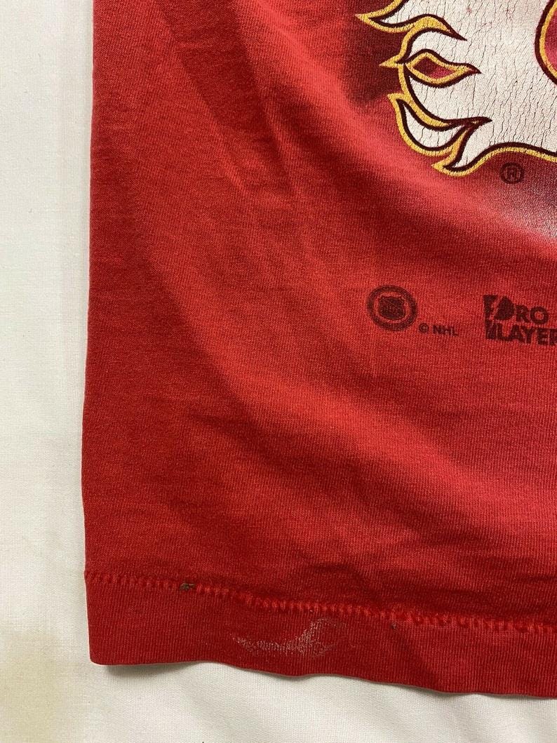
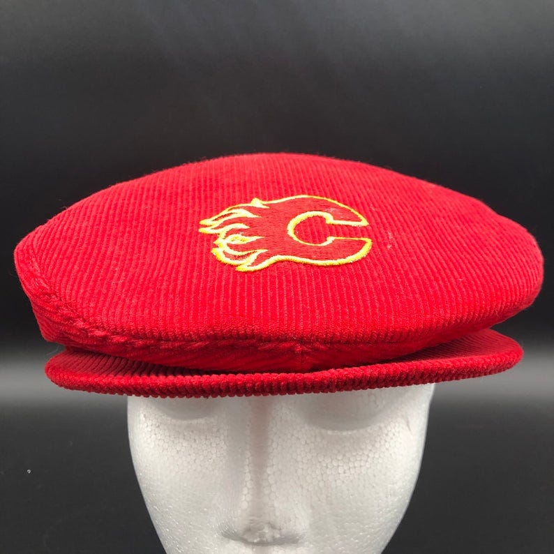
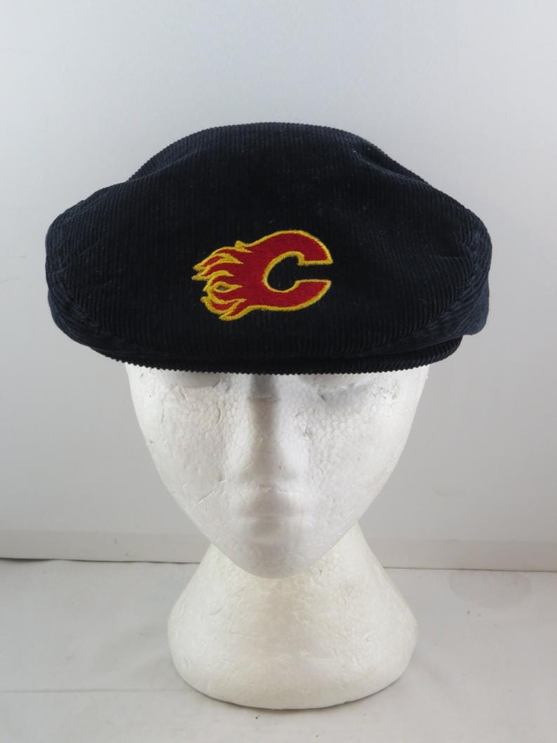
Rating Flames clothes from the 80s and 90s
This was very fun and I want to buy all of them
By Ramina (@raminashlah)
It’s retro week here at Scorchstack! And also the NHL but we matter more. I thought it would be fun to go through and find Flames clothes from the 80s and 90s that people sell on sites like Etsy or Depop, or just wherever I can find things. And I was right! This was very fun. I have a work meeting in 40 minutes that I have to prepare for and I’m doing this instead. Yes, I do have a real job outside of Scorchstack. Scorch isn’t my sole employer.
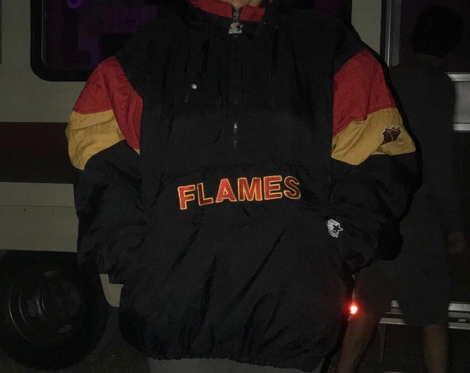
Before we get into this, check out this jacket my dad’s had since 1992. It absolutely fucks and I wish it wasn’t 7 sizes too big on me.
Another “before we get into it” when I say retro, I mean like ACTUALLY retro. Not something made two years ago that has a 90s feel to it. I mean there’s absolutely a nacho stain on it or the design would absolutely not be allowed to be sold today.
Alright, let’s for real get into it now. I’ll also be linking everything if you want any of these.
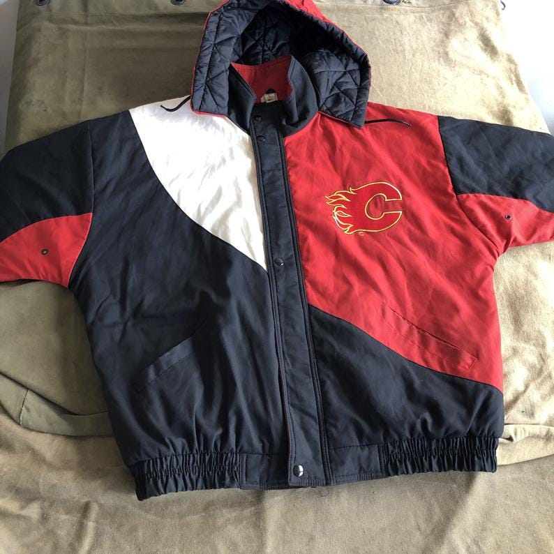
This item can be found here for $60. This jacket is very sexy. I wish I had $60 to get this. Not only is this clearly from decades ago, but this in fact would be something sold today. Except it wouldn’t be sold by the Flames, this kind of jacket design (not the logo, just the colours and style) would be sold by like, Fashion Nova under a TikTok influencer’s line of clothing. I give this an 8/10. Two reasons why it’s not 10/10: I’m not the biggest fan of the hood, and for the reasons I gave about the design being sold today. Doesn’t give it a true oldie vibe, you know?
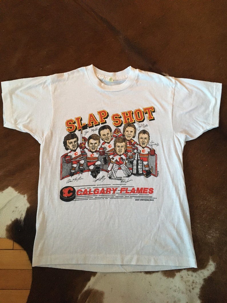
This next item can be found here for $100. This shirt also absolutely fucks. When I tell you I’ve had this in my cart for over a year, I mean it. I don’t get how nobody has bought it. I almost wanted somebody to so I wasn’t tempted in buying it. I don’t think I want to drop $100 on this but if you do, please do so. This is truly something that would not be made today. I also rate this 8/10. Two reasons: Price point and the fact that Mike Vernon’s in this.
Alright, I need you guys to prepare yourselves for the next one. Are you ready? Please get ready.
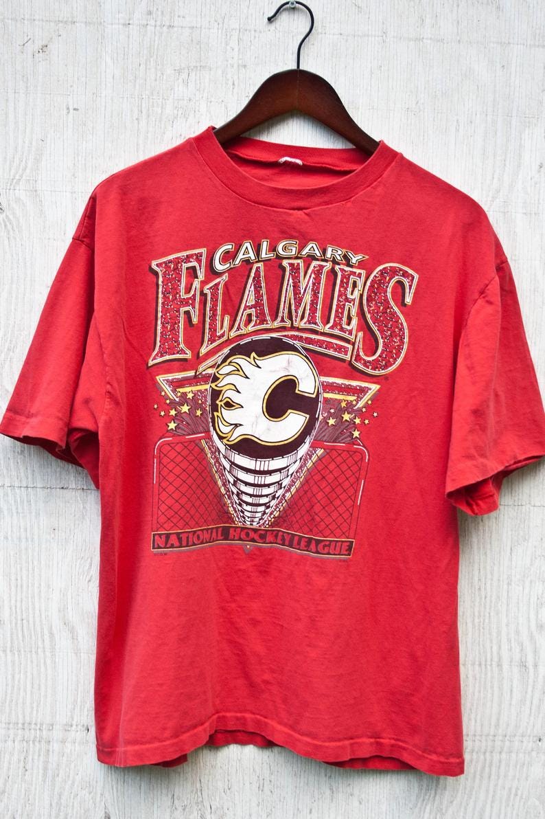
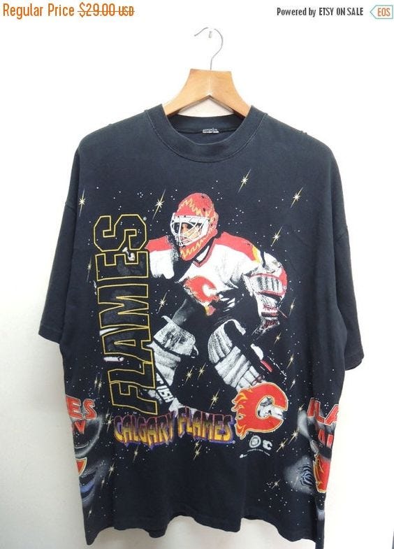
This one can be found here for $38. It’s awful. And not so bad to the point that I need to have it, it’s just bad. Like even for the 90s. How did this ever get approved? Look at the confetti (?) inside the Flames lettering. The stars???? It’s coming out of the net??? Nothing makes sense. Nothing about this is cohesive. It’s just bad and I would never wear this, 1/10.
This one can be found here for $54.74. This has Fleury so I normally wouldn’t want it, but this one is actually very good and cool. Like, this wouldn’t be made today at all, so if you got a shirt like this, everyone would immediately know that you’re cool and vintage. Although,
Very clear cum stain. I’ll rate this a 9/10. The price is a bit steep and it’s Fleury which knocks it down a peg, but the cum stain increases the rating.
Alright, now most of those were from the 90s except for that slapshot one. Now we’re really getting into the good stuff: the ones from the 80s. These ones are all SO good. I need you to prepare yourself for them because I genuinely don’t think you’re ready for what I’m about to show you.
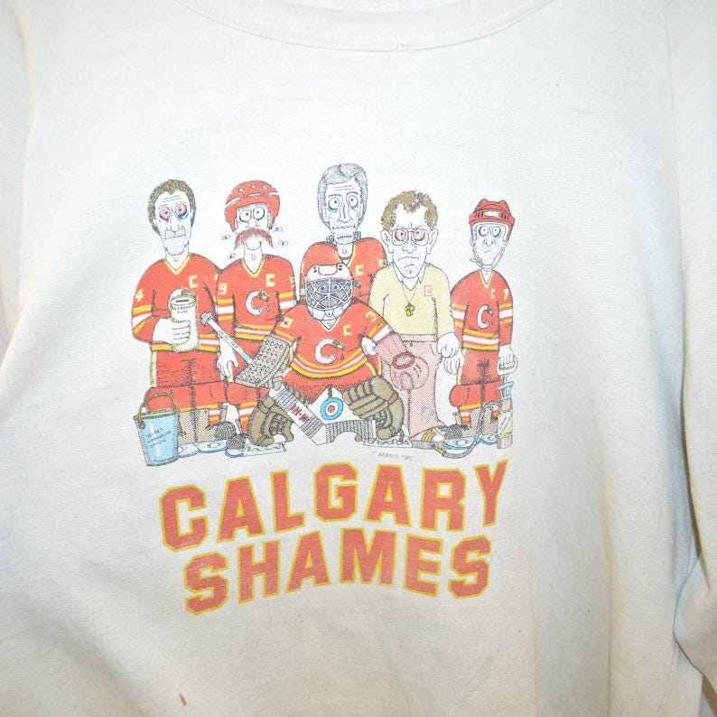
This one can be found here for $54.74. I don’t think anyone can fully understand just how much my jaw dropped when I saw this. This is objectively the worst thing I have ever seen and I have to have it. It’s currently in my cart, I may drop over $50 on this. I wouldn’t be caught dead wearing it. And yet, here I am. Don’t worry everyone, they also have a black one.
Yes, baba and I can now match. It’s what we’ve been waiting for. Both of these get a 10/10, fuck it. They’re SO good. The emotion I felt when I first saw these was unlike any emotion I have ever experienced before. It’s truly indescribable.
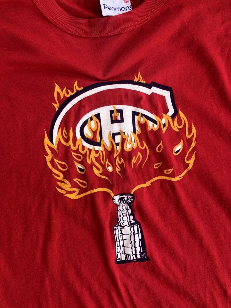
This one can be found here for $41.07. You guys, how incredible is this? If you have a Habs fan in your life, you have to have this. It’s so good, this would never be allowed to be sold today. I’ll give it a 9/10, only because in 2020 it may not be extremely clear this is about 1989, but if you wore this in 1989, you would immediately get laid.
Alright, you guys. I need you to prepare for this next one. It’s again just so good. Nobody is doing it like this anymore.
This can be found here for $55. Are you kidding me? This is truly unbelievable. It would literally be illegal to wear this today. Nobody would ever make this past the year like, 1993. I need it so bad, someone please buy this for me. It’s just. It’s so good. 10/10.
This can be found here for $42.71. I have no comments on this. I just needed to show it. It’s something Baba would wear. 9/10.
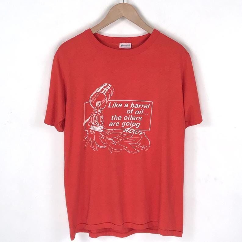
This can be found here for $120. This one is supposed to be a “Haha Flames suck we’re going to make this shirt about them.” Ok, well why did you make the shirt extremely cool? That’s on you. The price is quite steep but in my opinion, it’s absolutely worth it. I give this an 8/10.
This one has already been sold, but I needed to include it. There is way too much going on here. It’s too much. There’s no way this got approved. And yet here we are. Whoever owns this shirt, please give it to me, I must have it. It’s so bad. 10/10.
This last item for the day has also already been sold but again, I had to include it. There’s no way this is real. It’s unbelievable. I’m truly at a loss for words. The stars??? The word Flames twice??? I can’t even begin to understand. It’s so bad, it’s objectively awful. 9/10.
That’s all for today! These are not all the items, but it will require lots more digging and this is already very long. I may do a part two in the future. If you choose to purchase any of these, please tag me or the Scorchstack on Twitter. And also please consider buying me one.
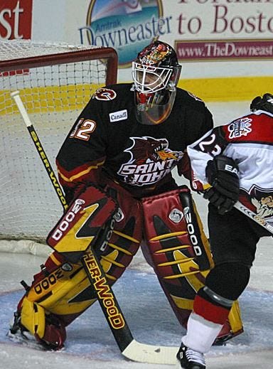
In light of the Flames bringing back Ol’ Blasty, should they also consider bringing back the flaming dragon jersey that the Saint John Flames used to wear?
By Christian (@decayinwtheboys)
Yes, it’s sick as fuck.
Up Next Week
There’s about 300 articles that are still awaiting a part B or continuing series that have been quietly put on hiatus that we might be revisiting.
Or perhaps something else shiny catches our eye and we write about that instead, who knows.
Also more killing time until hockey actually comes back


